My mind has the habit of putting order and classifying everything that it sees.This is true of comic artists and comic styles as well. One style I've recently been thinking about is the high contrast style.
It can be argued that
Steranko started this whole style off with his later
Film Noir style that he used in his book,
Red Tide.
 |
| Jim Steranko from Chandler: Red Tide (1976) |
After he left
Marvel in the mid 70's
, Steranko created a
graphic novel based on
Raymond Chandler's pulp fiction called "
Red Tide". It utilized the high contrast black and white pictures which was a defining factor in the film noir movement.
 |
| Jim Steranko from Chandler: Red Tide (1976) |
 |
| Jim Steranko from Chandler: Red Tide (1976) |
 |
| Jim Steranko from "The Shadow and Batman"illustration |
Precocious young
Frank Miller came along in the late 70's and assimilated a number of legendary creators work such as
Will Eisner and
Steranko. So, in the early 90's, when he went out on his own, his penchant for crime and film noir style work came out full bore in his
Sin City.
 |
| Frank Miller from Sin City |
Frank Miller's work is much less realistic and more stylized than Steranko's Red Tide but what he lacks in detail and subtleties, he makes up for in page layouts and composition. Miller is one of the undisputed masters at story telling in comics. Very few artists can compete with the way Miller uses panels and page layout to convey meaning as you can see in these few pages from Sin City.
 |
| Frank Miller from Sin City |
 |
| Frank Miller from Sin City |
So in the mid 90's
Miller, with the critical success of his
Batman, the Dark Knight Returns, was a top creator and one highly estimed by his colleges. So it's no surprise that a young
Tim Sale would adopt
Miller's Film Noir,
Chiaroscuro style for his stories with
Geoff Loeb in stories like
The Long Halloween and
Dark Victory.
 |
| Tim Sale on The Long Halloween |
 |
| Tim Sale |
 |
| Tim Sale on The Long Halloween |
 |
| Tim Sale |
It's kind of fitting and probably no coincidence that
Miller inspired
Tim Sale was asked to illustrate these
Batman stories that continue where
Miller and
Mazzucchellii's Batman Year One leave off. One difference
Sale has from these other two artists is his often exaggerated and cartoony his figure.
|
|
Tim Sale illustration of Batman and The Joker. Check out that mouth for cartoony exaggeration! |
At times I feel like you can see the slight influence of the hugely popular
Todd McFarland's often exaggerated style on some of his work in the way he makes some characters kind of cartoony.
Another comic artist that used a similar high contrast style is
Peter Snejbjerg. He worked on more mature books of the late 90's like Starman and Sandman Mystery Theater.
 |
| Peter Snejbjerg on Starman #65 |
Snejbjerg has a much more simple style compared to Sale. His line and brush work is much more strait forward and simple, but the strong contrasting Chiaroscuro style is really evident.
 |
| Peter Snejbjerg on JSA #31 |
 |
| Peter Snejbjerg on Detective Comics #27 |
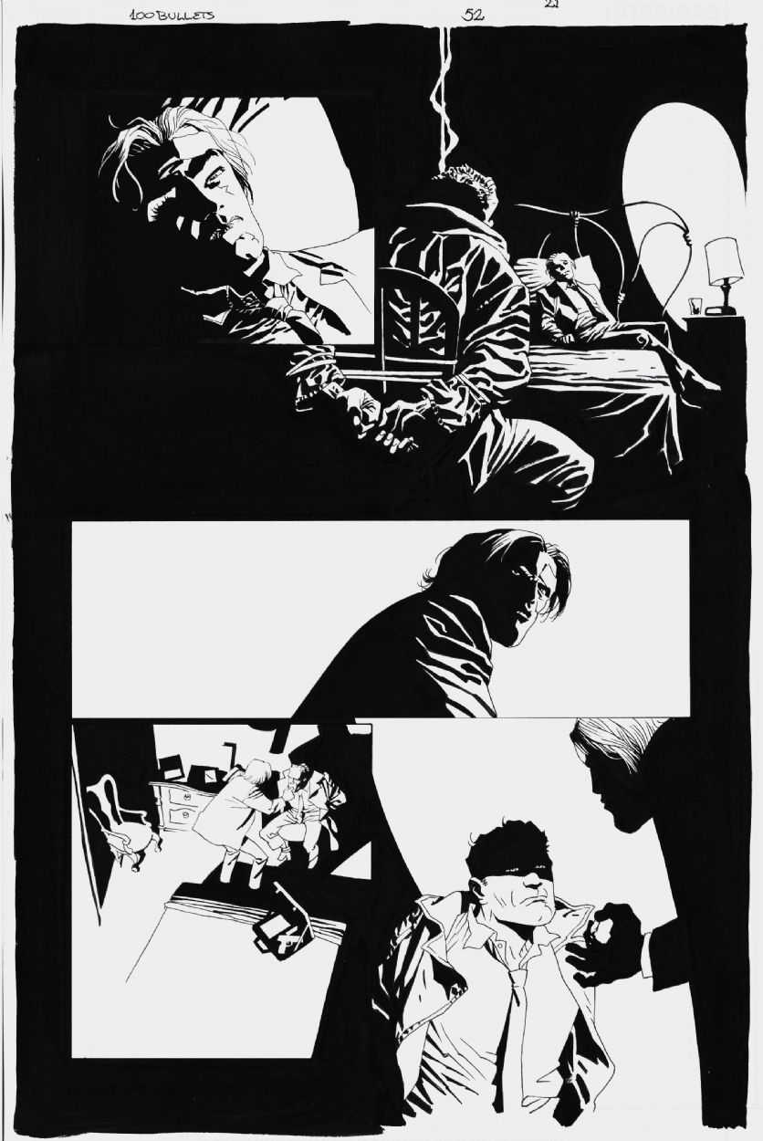
Eduardo Risso burst on the comic scene with his work in the award winning 100 Bullets.this Film Noir style is the perfect style for this pitch black crime story about crime families and their assassins/enforcers.
 |
| EDUARDO RISSO - 100 BULLETS #69 PAGE 13 |
Like his predecessors, he doesn't go for much realism in his Chiaroscuro style. Rather he mixes strong contrast with caricatures that are strongly expressive in their expressionistic way.
 |
| EDUARDO RISSO - 100 BULLETS #52 PAGE 21 |
 |
| Eduardo Risso Batman/Superman illustration |
I think the strong blacks really attract me to this style. The black works similarly to rhythm in music in that it grounds the work and creates a kind of primal, primitive feel to the work that energizes and drives the story along. Perfect for a dark, crime story.


Good article! You can trace Steranko's high-contrast style back to one of his later Marvel works "Tower of Shadows" #1 story "At the Stroke of Midnight". Here's the unused cover for his story: http://3.bp.blogspot.com/-7JgmZVzq7Y0/UK-Qc2YVxnI/AAAAAAAAIes/KgKLR5jcIU4/s1600/steranko+tower+of+shadows+cover+unused.jpg
ReplyDeleteAnd here's some art from the interiors - the color really hurts it but you can see the style emerging here: http://goodcomics.comicbookresources.com/2011/09/10/silver-age-september-jim-sterankos-at-the-stroke-of-midnight/
There´s also (for example) a lot of Jose Munoz Alack Sinner-Style in Frank Miller's Sin City-Work,
ReplyDeleteYou make a good point about Steranko's Noir-influence and picked great examples, nice work!
Steranko was heavily influenced by the 1950s E.C. comics work of Bernie Krigstein (see "In the Bag," "Catacombs," and "Master Race," among other stories). Alberto Breccia's "Mort Cinder" and Poe adaptations in the early 1960s are also high in contrast.
ReplyDeleteIn 1985, before Mlller or Mignola embraced Expressionist art styles, Alec Stevens drew Lovecraft's "The Outsider" for Fantagraphics, followed by other stories, before moving on to the DC/Piranha Press graphic novels The Sinners (1988) and Hardcore (1989), and Dostoyevsky's "The Onion" for Heavy Metal magazine in 1990, all predating Sin City and Hellboy.
Here's that 1985 story, drawn when Stevens was only 20 years old:
https://www.google.com/amp/thebristolboard.tumblr.com/post/77430622428/forgotten-masterpiece-the-outsider-by-h-p/amp#ampshare=http://thebristolboard.tumblr.com/post/77430622428/forgotten-masterpiece-the-outsider-by-h-p
Searching for training programs can be a difficult affair because there are numerous courses with all sorts of titles and many of them have exorbitant fees that could be restrictive for many individuals. קורס מכירות
ReplyDelete